

RESPONSIBILITIES: User research, user interviews, persona development, ideation, UX design, wireframing, prototyping, UI design
BACKGROUND
While planning a trip that spanned several cities with a group of friends, I found myself consulting an endless variety of resources: TripAdvisor, Google Maps, Youtube, personal blogs, local tourism sites, and travel forums, just to name a few. In order to circulate the information I was able to glean with my friends, I recorded everything manually into a shared Google Spreadsheets file, so that everyone could both view and add their own information.
However, even just recording the information required several tabs to keep track of the itinerary, lodging, travel, costs, packing, and reservations. I also had to constantly refer to Google Maps to get a visual understanding of where our points of interest were and how feasible it was to get to each one.
“There HAS to be a better way,” I thought over and over.
INSPIRATION
While looking for a better planning tool, I came across several options, but the one that stood out to me the most was Google Trips for its sheer potential. Google Trips is a travel planning app that pulls information from Google’s own gargantuan Maps network to suggest places to go, things to do, and create an itinerary. Below are some screenshots of the current interface.

The trip’s overview screen

“Things to do”, with suggestions separated into categories

“Saved places”, list view

“Food & Drink”, with suggestions in separate lists and maps by category

“Getting around”

“Day plans”, which automatically generates half-day or full-day itineraries
Score!… or not. I quickly realized that the app was far from ideal.
Things to do: After pinning my chosen destinations, I found I couldn’t turn off the extraneous suggestions. I had to go back to the trip’s overview and tap on “Saved places” to see my isolated pins. A minor annoyance, but it seemed unnecessary to separate the two functions into individual tiles.
Food & Drink: Another function that was separated out was “Food & Drink”, which bizarrely did not follow the same search format as “Things to do”. Lists by categories had their own individual maps instead of one consolidated map for all the food and drink suggestions.
Getting around: This tile only had descriptions of and website links to transit options, and was functionally useless.
Day plans: This is where the real frustrations came in. Instead of allowing me to build my own itinerary from scratch, Trips would automatically create one based on popular attractions. I would then have to manually remove and add pins to the route. Auto-create was even set to prioritize my saved places, but it didn’t seem to matter.
Trips had the potential to be a powerful tool with all of Maps’ infrastructure embedded in it, but it didn’t seem to be widely used. I was starting to see why. Rather than create a planning tool from scratch, which would likely use a portal to Maps anyway, I decided to revamp the Trips app to take better advantage of such an incredible resource.


PRIMARY RESEARCH: INTERVIEWS
I interviewed several globetrotting professionals to see how their planning habits and opinions related to my own. I asked them questions on how they usually went about outlining their trips and what their experiences were with using Google Trips in particular.
Key Findings About Trip Planning:
People generally preferred using a combination of Google Docs, Spreadsheets and Maps because of their easy interfaces and collaborative ability for group trips
They tended to plan a longer trip (more than a few days) by first picking cities, listing out all the activities they wanted to do, then grouping them by location, and finally assigning the groupings to dates based on what made sense for their schedule
Everyone stressed the important of accounting for travel time in between cities and points of interest within those cities
Out of those interviewed, only one person had ever interacted with Google Trips, although several more had heard of it. I asked those that were unfamiliar to try it out unguided as I observed. Many of my own thoughts about Trips were validated by the the others.
Key Findings About Google Trips:
People found it to be confusing and difficult to personalize their own itinerary in “Day plans”
A majority expressed annoyance over the related features (“Things to Do”, “Saved Places”, “Day Plans”, “Food & Drink”) being separated into tiles, rather than being consolidated
There was no easy way to see a single overview of the whole trip, especially if it included multiple cities
Features everyone did like were the ability to link reservations from their Gmail accounts and to download the trip for offline use
PERSONA
To help guide the project, I created a persona based on the collection of interview answers.

IDEATION
Once I had a user in mind, I started sketching ideas for possible features and interactions.

USER FLOW
I focused on narrowing down and combining ideas that specifically addressed the pain points from the interviews and the persona’s needs. I wanted to incorporate:
A clear visual overview of the whole trip
Consolidated information on and presentation of points of interest
An easy and intuitive way to create a day’s itinerary
These ideas were used to create a decision tree with all of the app’s possible interactions, which would help determine the user’s journey through the app.

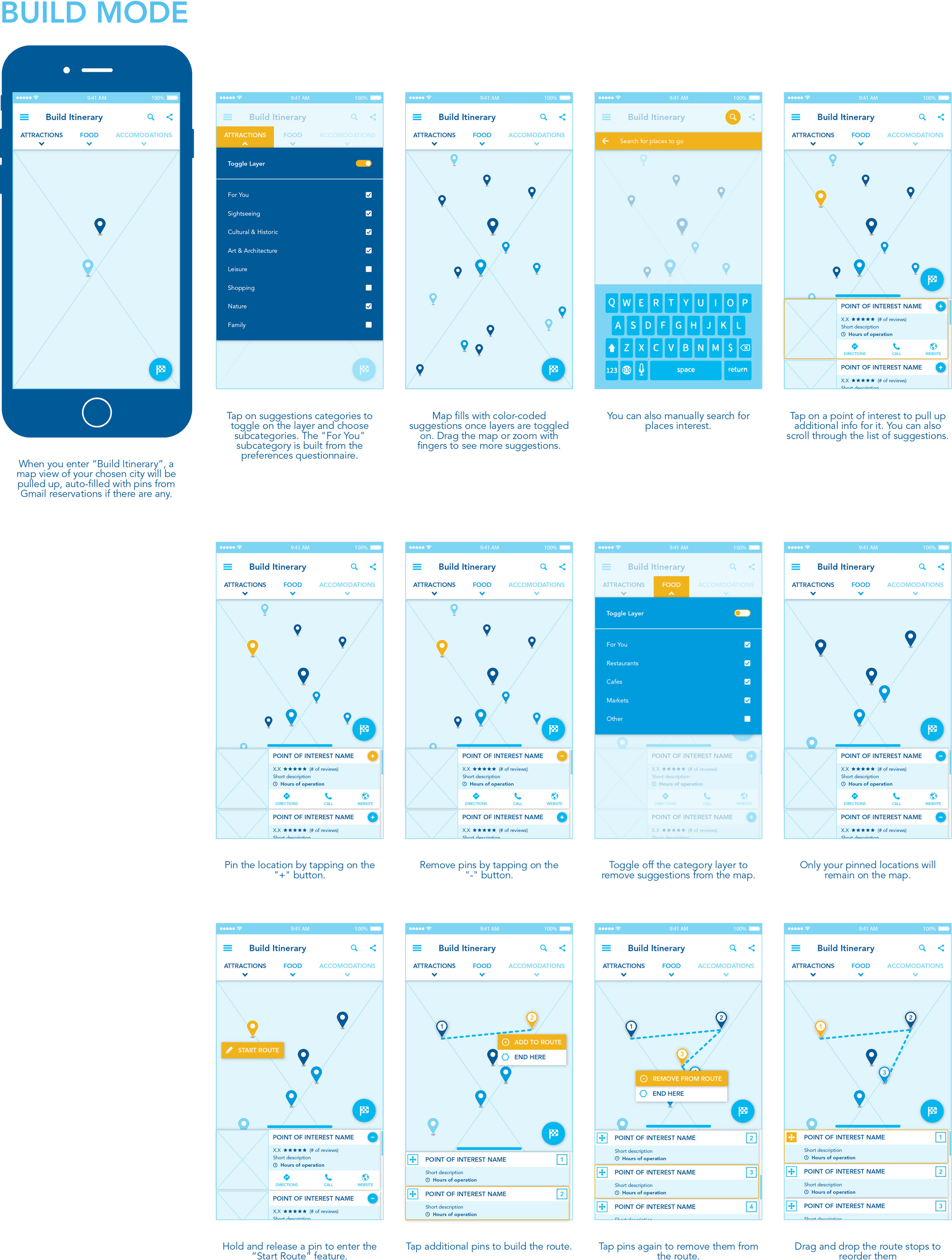
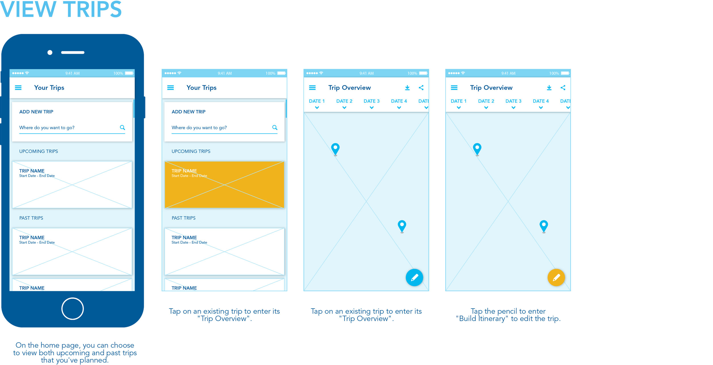
WIREFRAMES
The decision tree was then turned into a set of wireframes. The app featured two main modes:
Build Mode, where users could choose their destinations and transit methods, and make edits to their trip
Overview Mode, where users could see their whole trip in one place without the distractions of decision-making

USER TESTING
I presented the wireframes to those that were initially interviewed to get their feedback, since they were now at least somewhat familiar with Trips and could compare with it. They were given the wireframes to navigate unguided, and then asked the following:
What were the pain points, if any?
How difficult was it to understand how to find and pin desired places of interest?
How difficult was it to understand how to build an itinerary?
Was the consolidated trip information presented clearly?
Were the layers useful?
Were there any other features you wanted to see?
I wanted to test if the new app design actually improved upon the original by gauging how intuitively users were able to follow the flow of interaction, the perceived transparency of features, clarity and ease of access to the trip outline, and ease of editing the trip.
Key Findings:
How the toggle layer feature worked wasn’t made clear
The finger drag motion to draw a route wasn’t ideal for pins that were too close to each other or too far apart
Users mentioned a desire for the app to learn their preferences to help tailor suggestions better
REFINEMENT
I took into account the feedback from the testing session to make the wireframes more polished, clearer in both design and flow, and also include more features.
Incorporated an accent color to better highlight interaction points
Added a preferences questionnaire so the app could curate recommendations in a “For you” list
Added screens of secondary features like manual search, download, and share


FINAL MOCKUPS
I designed a quick UI screen as an example of what the finished product might look like.

FUTURE STEPS
The app needs to be fully built out to run another user testing session, and get more concrete feedback. More possible features to include for a more comprehensive app are:
Weather information and packing suggestions
Extra filters for search, such as by price range, ratings, etc.
Costs breakdown